Ditascom: Diocese of Tagum Social Communications Ministry
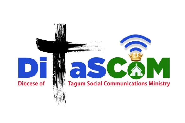
The logo of the Diocese of Tagum Social Communications Ministry (DiTaSCOM) incorporates several elements, each representing different aspects of our mission and identity:
- Ash-formed Cross in Black: This foundational element serves a multi-purpose. It cleverly integrates the letter “T” for “DiTaSCoM.” Simultaneously, it stands as a powerful representation of the diocese of TAGUM. The deep black hue of the ash-formed cross encapsulates spiritual bedrock, evoking themes of repentance, transformation, and the cornerstone of Christian belief in the crucifixion and resurrection of Jesus.
- Church in White: Radiating purity and unity, the white church encapsulates the multifaceted essence of the Church itself – embracing the Cathedral, parishes down to Gagmay’ng Kristohanong Katilingban (GKK’s), and the entire diocese with the bishop as its spiritual leader. It also mirrors the essence of faith, fostering a sense of unity and spiritual elevation within the diocese and beyond.
- Crown in Yellow Above the Church: Positioned with noble intent, the crown represents authority and honor of Christ the King. Placed above the church, it symbolizes the Christ’s pivotal role as the foundation of our ministry. The golden hue conveys wisdom, enlightenment, and divine power. This visual element underscores the authoritative and guiding role of Christ in our ministry.
- WiFi in Blue Above the Crown: This forward-looking addition modernizes the logo, signifying contemporary modes of communication and technology. Its placement above the crown accentuates the importance of leveraging these tools to spread the message of faith and furnace connections within the community. The calming, trustworthy blue hue underscores the significance of effective communication in nurturing spiritual growth and transformation.
- Blue in DiTaSCOM Caption: The choice of blue in the caption “Ditascom” holds profound meaning. Traditionally associated with the Virgin Mary, it embodies purity, serenity, and the spiritual presence of the Mother of Jesus. This color choice signifies the ministry’s dedication to seeking guidance and intercession from Mary in our communication efforts.
- Green in DiTaSCOM Caption: The verdant hue, emblematic of growth, life, and renewal, signifies the ministry’s unwavering commitment to fostering spiritual development and sustaining the faith of the community through its communications endeavors. This color embodies vitality, progress, and an ongoing cycle of spiritual growth.
- Red in the Caption “Diocese of Tagum Social Communications Minitry”: This vibrant hue, deeply ingrained in Christian symbolism, embodies the Holy Spirit and the fervor of Pentecost. It additionally conveys attributes of love, passion, and sacrifice. In this context, the red caption emphasizes the dynamic and fervent nature of the Diocese of Tagum Social Communications Ministry’s work & endeavors, along with its unyielding dedication to spreading the Gospel message. It serves as a vivid testament to the Diocese of Tagum’s spirited and influential presence within the ministry, our diocese and beyond.


No Comments